Presented data is undefined, misleading

Sapienza: Determined to get to the truth
MANCHESTER, NH May 9, 2026–Following more than two weeks of pressure from Girard at Large and aldermen Ed Sapienza (R-Ward 8) and Crissy Kantor (R-Ward 6) to release state required budget information, the Manchester School District quietly added that data to its Web site. So quiet was the publication that Girard at Large learned about it from Manchester City Clerk Matthew Normand, in an email transmitting information from a Right to Know request made of Mayor Jay Ruais, demanding he provide any and all information he claimed the district published in February that satisfied the state requirement.
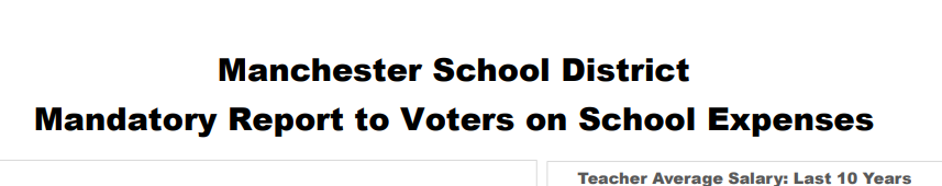
As we went to publish the information, we noticed that the information presented did not align with the official figures published on the NH Department of Education Web site. We also took note of the district’s disclaimer that the published numbers were “adjusted for inflation to November 2025, using BLS calculator.” (NB: BLS stands for Bureau of Labor Statistics.) We also saw that the data ended with the 24-25 school year, not the current one.
Rather than publish the graphs as discovered on May 2, Girard at Large made the following inquiry of Superintendent Jennifer Chmiel on that day:
The link below is to the district’s effort to comply with the Student’s First Act. It would be helpful to know, exactly, where the district pulled the numbers from, how it adjusted them for inflation and the exact dates it used for the specific start and end dates. Needless to say, none of these numbers align with any publicly available source of information. Thanks.

Kantor
The rational for this information is simple enough. Unless the district discloses the exact numbers it used and the exact dates it entered into the inflation calculator for each year, it’s not possible to know the validity of the numbers. Moreover, since the district didn’t include current budget year information, why is it using numbers “adjusted for inflation as of November 2025,” since that date falls within the current school year, not the prior one?
The following Monday morning, Chmiel replied, saying:
Good morning-
We are in receipt of your email. We will review and be back in touch.
Jenn
As of today’s publication, the district has yet to disclose the information or methodology it used to create these graphs.
When asked by Girard at Large whether the district’s information satisfied the law, Sen. Keith Murphy (R-District 16), the law’s author, said that the information he’s seen from every other district has two lines on the graph, one showing the actual appropriations and one showing inflation.
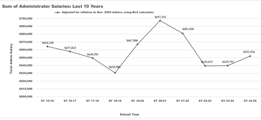
Taken at face value, the graphs paint an interesting financial picture; one that shows rising per pupil spending as average teacher salaries and total administrator salaries actually fall. In the case of the teachers, the average salaries fall from a high of more than $83,000 in FY 2017 to $73,000 in FY 25. Total administrator salaries fall from a high of more than $697,000 in FY 21 to just under $652,000 in FY 25. Both numbers have trended upwards sharply since hitting lows in FY 23.
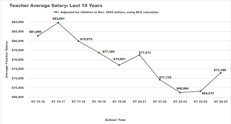
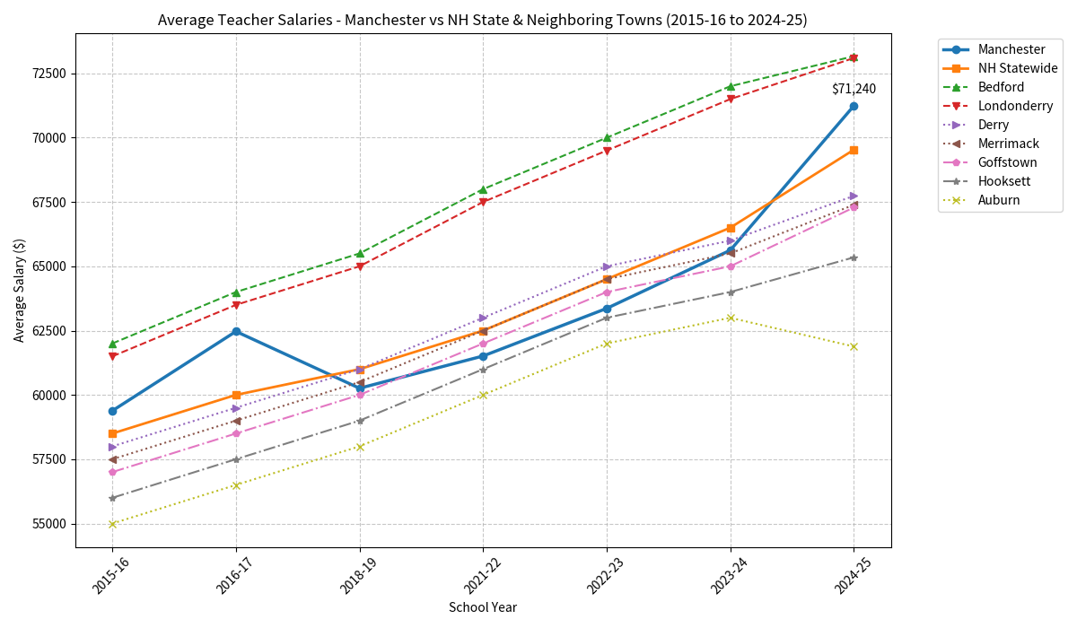
In reviewing state data, Girard at Large discovered that from the 2016 school year to the 2025 school year, the average teacher salary increased 20% from $59,384 to $71,240.

Chmiel: Looking for the data they used
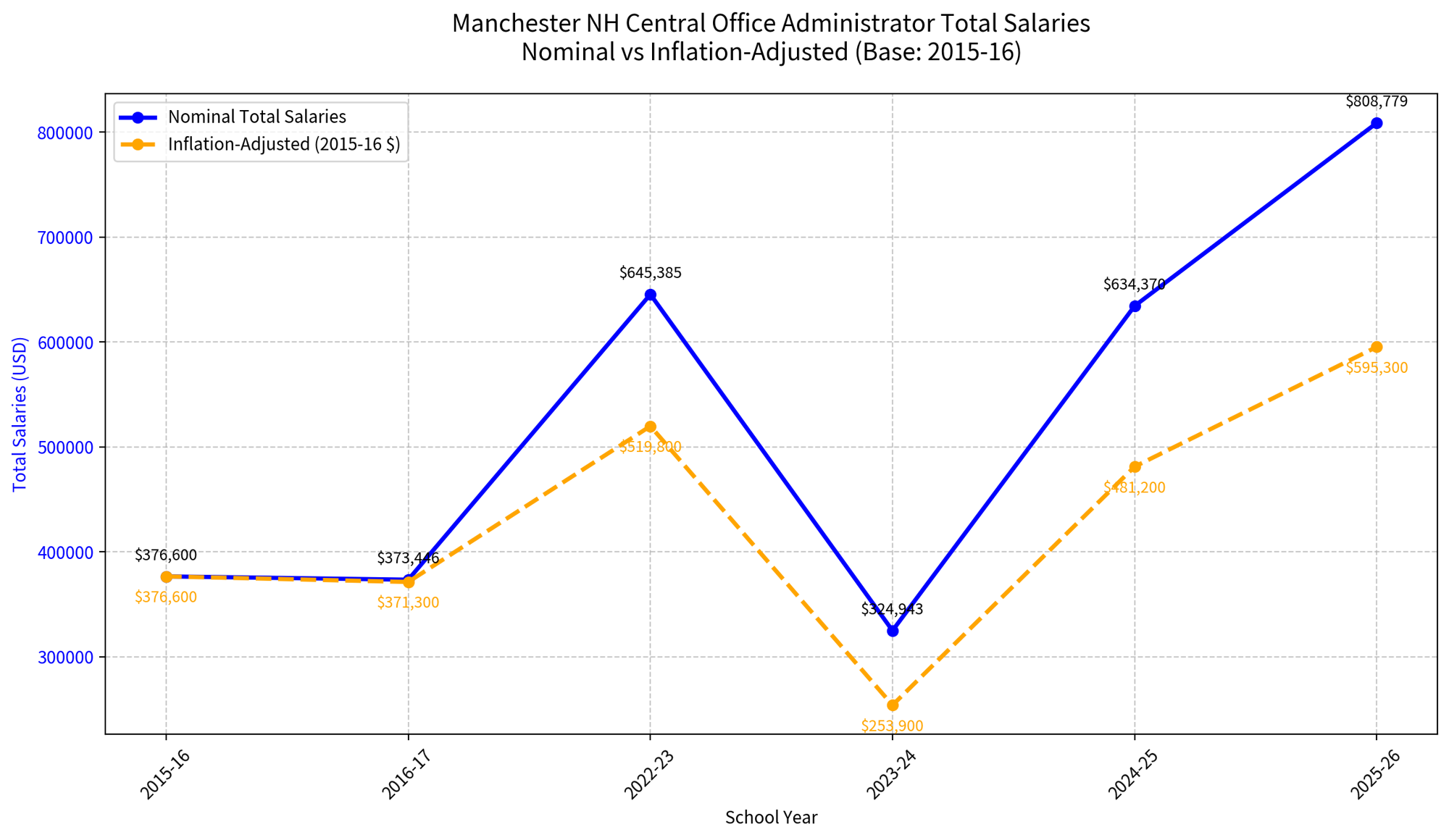
Salaries for the district’s top administrators, defined as superintendent and assistant superintendent level positions, jumped from $483,334 in the 2016 school year to $808,779 in the 2026 (current) school year; a staggering 65% increase.
Depending on the costs included, per pupil spending rose from either $11,712 in 2016 to $17,734 in 2024, an increase of 52%, or from $12,501 to $21,289 a whopping 72% spike. Note well, these increases do not include the spending increases over the past two years, which adds another $1,000 per student.
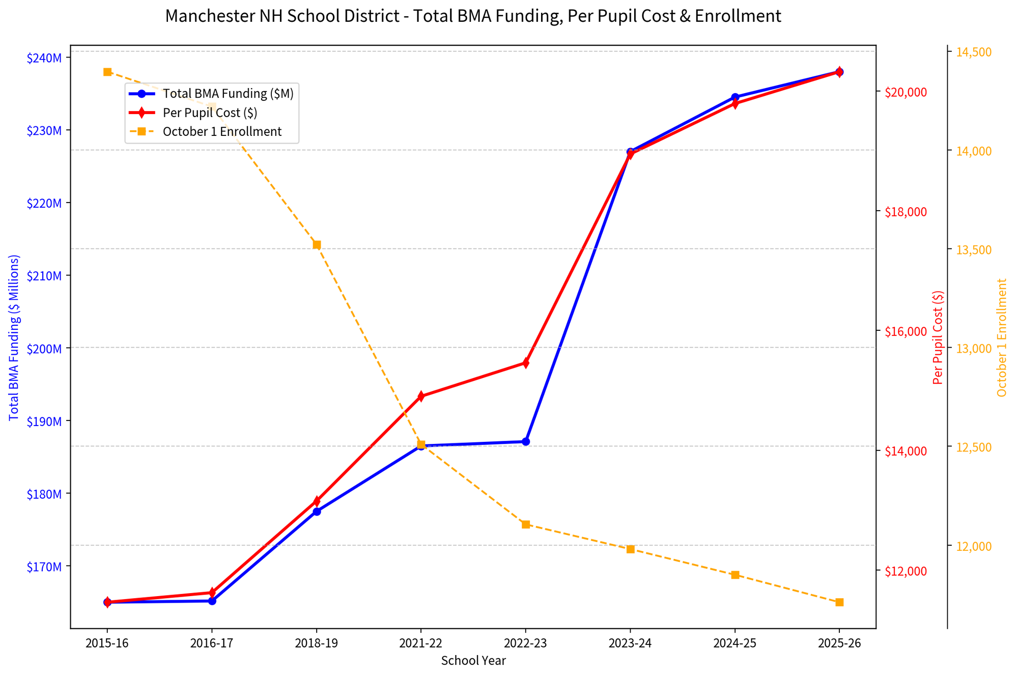
Meanwhile, in the face of escalating costs for teachers, whose numbers are unchanged over the preceding 10 years at 1,001, student enrollment has sunk by 18.2% from 14,318 in the 2016 school year to 11,711 in the current school year; a loss of 2,607 students. The number of students in the Free and Reduced Hot Lunch Program, has seen an even more dramatic drop, tumbling from 8,009 in 2016, which amounted to 57% of the student body, to 5,197, which is 46% of the student body. That’s a loss of 2,812 students; a dramatic drop of 35% that must be considered inasmuch as the district blames student poverty for escalating costs.
Girard at Large delayed publication of this article to both provide the Manchester School District a more than reasonable time frame to provide the raw data it used to produce its graphs but also to develop graphs and charts for both the state required data and provide context in which the spending is taking place.
First, we compare the district’s graphs with ones that show actual numbers alongside inflation adjusted numbers. We reiterate that the district did not provide the source of its data nor did it explain why it chose an unidentified date in November 2025 as the inflation adjustor given that November 2025 is within the 2026 school year for which it did not provide any data. Absent any explanation, it appears as if the district took the last school year’s average salary, increased it for inflation to create the $73,188 figure for that year, then worked the graph backward from that point to create the inflation adjusted number for each year.
Click to enlarge
Below the next paragraph is the graph we used using average teacher salary data available on the NH Dept. of Education’s Web site. We created tow lines. The blue line shows the nominal (actual) average salary recorded on the NH DOE’s Web site. The orange line factored inflation as of July 1 for each school year starting with SY 17 (2016-2017). You’ll note that both lines start at the same amount and move from there.
Please know that average salary is a simple calculation that divides the total amount spent on teachers and divides it by the number of teachers. As such, that number necessarily reflects changes in the seniority of the staff. As teachers at the top of the salary scale retire or otherwise leave the district, they are generally replaced with less senior teachers that are paid less. The more top of scale teachers are replaced with lower end of scale teachers, the less the average salary will increase. Therefore, neither their graph nor Girard at Large’s is an accurate indication of whether or not teacher pay is keeping pace with inflation. To determine that, an analysis would have to be done of the district’s pay scales to determine how step increases (those given simply because the teacher has completed another year) coupled with cost of living increases are boosting teacher pay from year to year. Because the average step increase is about 5%, any teacher who is more than three steps from the top of the scale will receive about a 15% increase in pay over the typical 3 year contract, not counting any cost of living increase.
Click to enlarge
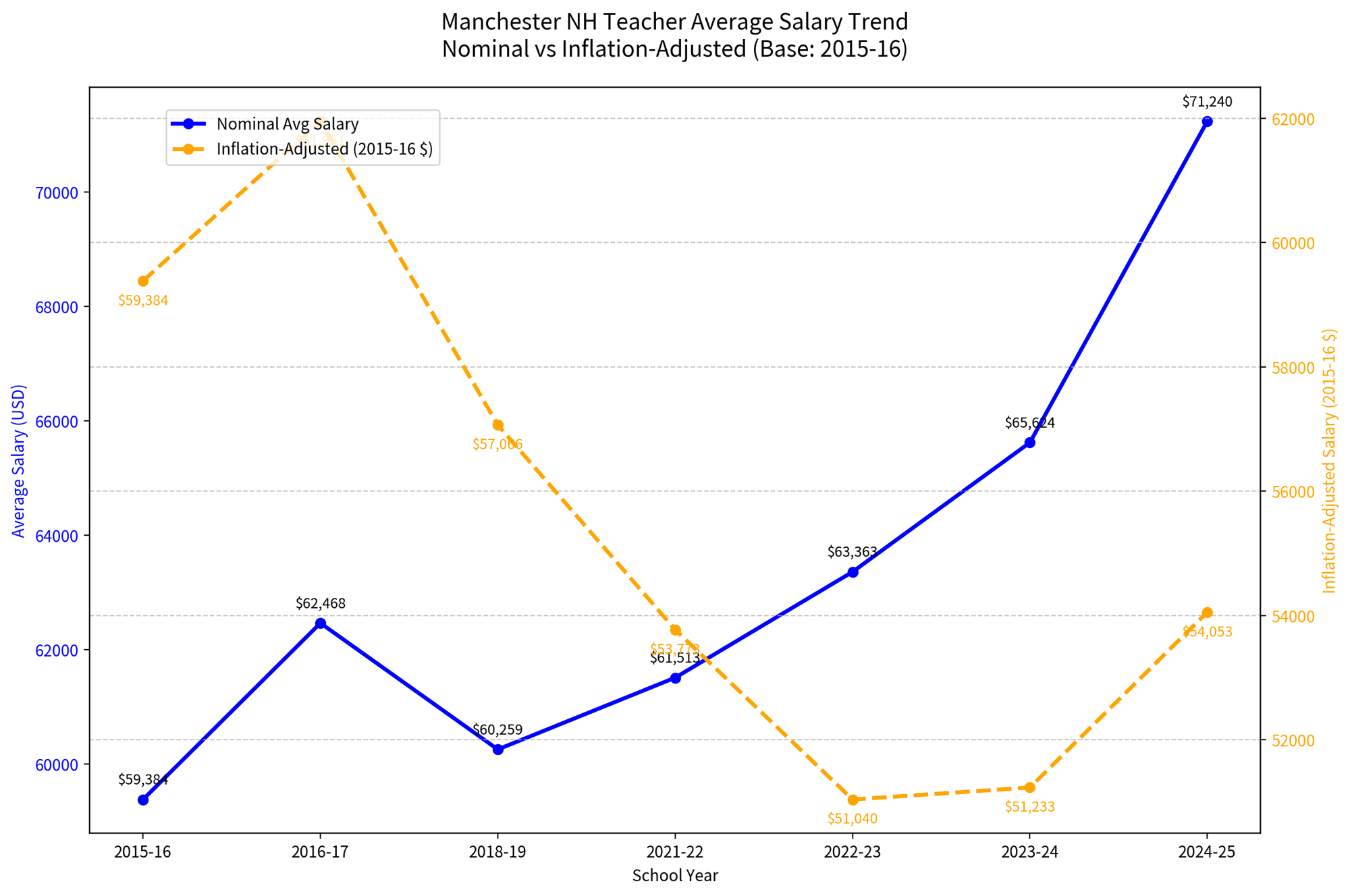
For context, we created a line that added the number of teachers for each year to the graph. Note well that the third line changes the axis against which the nominal and inflation adjusted salary numbers are shown. Arguably, this one provides an easier to follow comparison between nominal and inflation adjusted salaries. NB: Because the state Web site does not have teacher salary numbers for the current school year, we are neither able to provide the nominal nor inflation adjusted average salary which, given the sizable pay raises granted in the current contract, will likely show sharp increases versus last year’s numbers.
Click to enlarge
Next, the district posted the graph below showing inflation adjusted numbers for total administrator salaries. As with the average teacher salary graph it produced, the district appears to have used last school year’s total salary number, factored it for November 2025 inflation and built the graph backward from that point. We also note the current school year’s information is available on the NH DOE’s Web site and the district chose not to use it. As you will see in the graph below, the reason may be obvious.
Below is the graph we created using the data on the NH DOE Web site, which, as stated above, does have this information for the current fiscal year.
Click to enlarge
Below is the graph we created using the data on the NH DOE Web site, which, as stated above, does have this information for the current fiscal year.
Click to enlarge
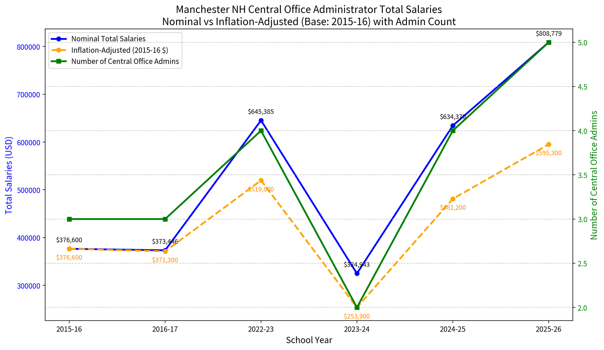
For additional context on this we added a line in the graph below showing the number of administrators whose salaries combine to create this data. The law defines administrators as superintendent or assistant superintendent level positions. We are unaware of any state data accounting for the “director” or “coordinator” positions that report to these upper levels of management.
Click to enlarge
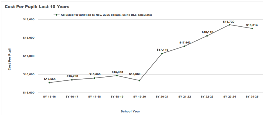
As with the other required state data, we are unable to determine how the district created the below graph on per pupil spending. We don’t know if the district is using “ADM” (Average Daily Membership) numbers to determine per pupil spending or the October 1 official enrollment numbers for each year. We also don’t know if the district is using numbers that include or exclude capital expenditures or why they’re showing numbers in November 2025 dollars when they’re not using that school year’s figures. Regardless, the graph clearly shows that per pupil spending has consistently risen in inflation adjusted numbers over the past decade.
Click to enlarge
For our calculations, we used the full appropriation of the Board of Mayor and Aldermen for each school year and divided that by official enrollment for each year as of October 1. We then factored for inflation as of July 1 of each subsequent year. This allowed us to include the current school year in our calculations. We excluded various ongoing federal funds such as TITLE Funds, which are about $25 million/year and COVID relief funds (ESSR). We also did not include any other grants or the School Food Nutrition Program.
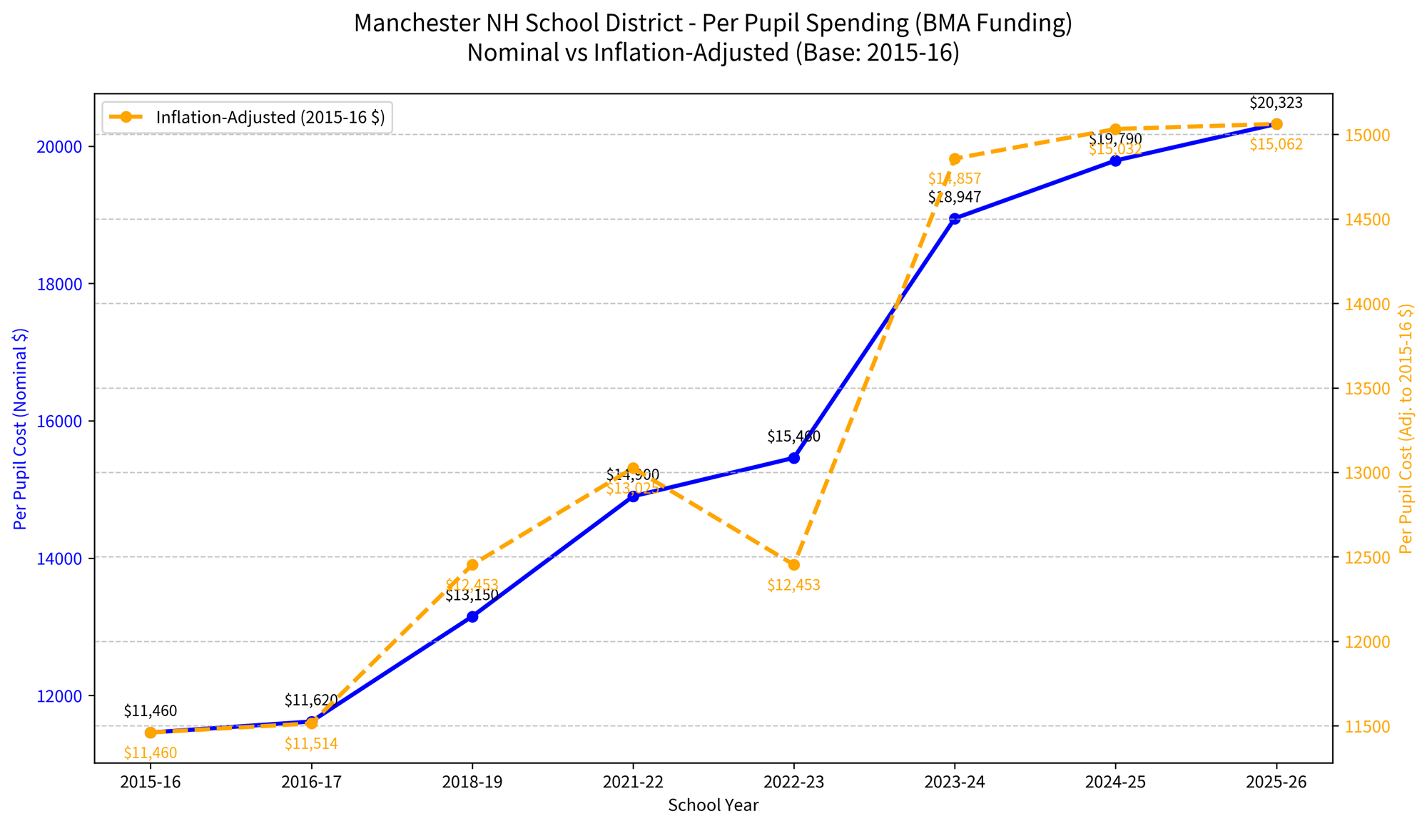
Click to enlarge
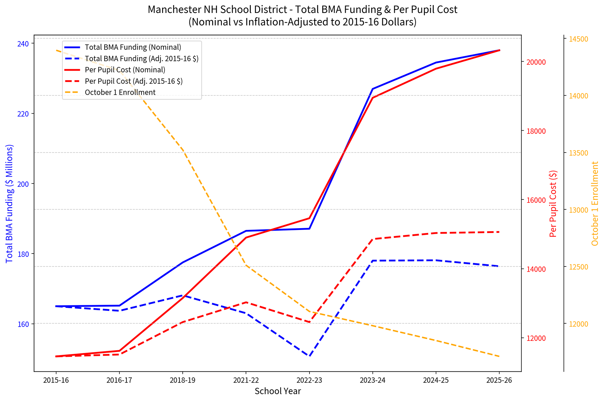
For context on the information in the graph above, we present the following graphs for your consideration as we think it’s particularly important to show not just per pupil spending, but overall spending, student enrollment and the number of teachers over the period of time. We factor any spending numbers for inflation as of July 1 following the base year.
Click to enlarge
Click to enlarge
Finally, we’ve heard how underpaid Manchester’s teachers are versus their peers in the state and the region. The below graph compares the official average teacher salaries for Manchester, all of the surrounding towns that touch its border and the state average. Again, these numbers don’t include raises granted for the current fiscal/school year, which were considerable.
Click to enlarge

